Making shopping fun again
Role
Product Designer
UX Researcher
Objective
Make shopping more interactive, fun, and personalized, focused on GenZ and Millennials.
Timeline
August 2023 - October 2023
Overview
Problem
Shopping online has become overwhelming. Young adults feel frustrated by ads, sponsored content, and the cognitive overload caused by the lack of personalization in major retailers.
Solution
I designed a user-first shopping experience that's personalized, interactive, and social, which makes shopping fun again.


Research Stage
User interviews
I conducted 8 interviews to better understand who our users are and their pain points when online shopping. Users interviewed were Gen Zs and Millennials living in the US. The interviews were done via Zoom or phone calls.


What users had to say
I learned that not everything is broken. Users also shared what they like about existing shopping platforms, which we then incorporated into the design process
"I like it when I see the carrousel of options with the price and brand, so I can automatically compare and choose”
“There are two ways to buy, one is when you need something specific, and the other is in a more explorative way”
“I look up reviews on TikTok, or sometimes I’m influenced by TikTok to buy stuff”
“Reviews are something critical for buying a certain product”
“ I like sharing the items I'm buying with some friends, sometimes I do it before or sometimes after”
Separating noise from signal
Throughout the interviews, I double-clicked into what were the users' real pain points when making online purchases and categorized them into four different groups of recurring problems. This is what I found:

The four biggest pains of online shopping
Ads / Sponsored content
-
Users find ads and sponsored content annoying and interrupt the shopping experience
-
Users have lower trust in sponsored products than non-sponsored ones
-
Competitive ads get in the way of users finding the item they actually want
-
Users have 2 mental models: Search or discovery
-
Existing filters adapt well to search (e.g. filter by color) but not to discovery
-
Users do care about narrowing their discovery process but in less constraining ways
Product search & discovery
Content & Information Architecture
-
Text overload generates unnecessary distractions
-
New products without reviews create hesitation to purchase
-
High quality photos give users confidence to buy
-
Information overload make the experience overwhelming and leads to app session dropoff
-
Users are tired of filling in the same information over and over again
-
Add-on features make checkout overwhelming and complicated
-
Users want a faster way to find past orders and tracking numbers
Checkout process
The user journey map
I created a user journey map focused on shopping in an explorative way. At the different stages, the users go through experiences and emotions. This exercise helped me better understand what interrupted the shopping experience.
.png)
Competitive Analysis
I conducted a competitor analysis to understand highlight and lowlights from the most used shopping platforms. Later, I incorporated highlights into the design process and designed around "needed" lowlights or eliminated them whenever possible.

Highlights:
-
Amazon Prime
-
Trust in Amazon
-
Wide range of products
-
Recommendations based on your search
-
Fast delivery and easy return
-
1 click ordering
-
Wishlists
-
Reviews and ratings
Lowlights:
-
Information overload
-
Low-quality photos
-
Too many ads
-
Some products could be of bad quality
-
Too much text at checkout
Highlights:
-
Variety of options
-
Competitive prices
-
Product recommendations
-
Daily new arrivals
-
Shein points and reward program
-
Reviews and ratings
-
Wishlists
Lowlights:
-
Information overload
-
Delivery can take longer than other websites
-
Low quality products


Highlights:
-
Any product you can imagine
-
Competitive prices
-
24/7 After-Sale service
-
Advanced filters with recommendations
-
Reviews and ratings
-
Wishlists
-
Free shipping and 90 day free return
Lowlights:
-
No trust and low quality products
-
Information overload
-
Deals look like scams
-
Pop up messages interrupt the shopping experience
Highlights:
-
Wide range of products (new or used)
-
Ratings and reviews
-
Money back guarantee
-
Best offer (negotiate the price with seller)
-
Buyer protection
-
Wishlists
Lowlights:
-
Users see risk of scam at this platform
-
Limited customer support
-
Delivery delays
-
Quality concerns
Ideation process with Crazy Eights
During the ideation stage, I performed the "Crazy Eights" exercise, asking myself what must be present in the experience to address the four pain points identified in the research stage. I selected an easy checkout, discovery search, reviews (photos and videos), exclude sponsored content, wishlists, and an easy way to find past orders.


Distilling the research and designing with findings in mind
After analyzing the Crazy Eights solutions, reviewing the positive aspects identified in the research stage, and examining the pros of the competition, these are the elements or experiences that must be included in my designs to address user problems and move closer to an optimal experience.
.jpg)
The main user flow
I created a user flow to understand the step-by-step process of the experience for making a successful purchase.
.jpg)
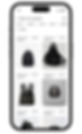
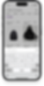
Paper wireframes

Search, shop by discovery and shop by categories

Filters to narrow down the options

Item selected with the option to add to cart and details below

Select a size (if shopping with sizes)

Option to view other details like measurements and reviews


See your added items and create lists. Easy checkout
Easy checkout with just one click and edit information fast
This is how a successful order will look. After that you can keep shopping or track your orders
A discovery way to shop. Th algorithm will show items related to your interests
The classic way to shop: categories to narrow down options
Bringing ideas to life with low-fi Figma prototypes
Home and search


Earlier we covered that users have 2 different mental models when buying online: Search & Discovery.
I started with Search as the primary action because this is the standard in Western online commerce, users are used to this, and expect it. However, with the rise of TikTok and Instagram Reels, discovery experiences are becoming more ubiquitous, and we'll cover them further below.
Filtering options


At first, I did not diverge too much from the existing filtering solutions in competitor apps, but later I learned this was a mistake. Traditional filters don't fit well with users' mental models. More details on how this was addressed are provided below.
Reviews, add to cart, and checkout


To make reviews more compelling, I prioritized images over text, and embedded reviews on TikTok, as we discovered many users use it to vet products. I also tested conventional and one-click checkout experiences.
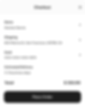
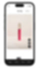
Easy checkout
%206.png)
%207.png)
One-click checkout lets users checkout more conveniently with their saved billing & shipping information.
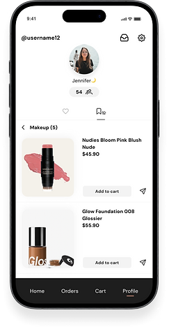
Orders and Profile


Finally, the Orders screen and the Profile screens with your information and settings.
UI Kit
Color Palette
#1E1E1E
#CC8C78
#CC8C78 20%
#BCBCBC
#F4F4F4
#F9F9F9
Fonts

Iconography
Components
Selected Item
Cart Item
For You Item
Checkout
Items
Filters
Nav Bar
Text Box FYP

Interactions
Black Button
Orange Button
Like and Save Profile
Confirmation Message
Search Bar
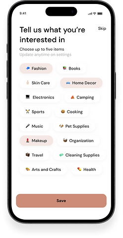
Interest Selection

Stress testing concepts with usability studies and finding opportunities

45%

82%

73%
Think filters were not solving their problems and wanted different ways of curating their results
Were confused about where you could find liked products in the "For You" page and how to create lists.
Think that the Profile experience was dull, same as others, and not interactive
Incorporating feedback and opportunities in my designs
01
Contextual filters, using AI
I learned that the users' process of narrowing a search does not necessarily fit with categorical definitions. While hard filters are helpful for a first pass, users want more subjective filters when refining their search. We're solving this with contextual AI filters.

02
An explorative way to shop and create lists
I learned that many users curate lists for future occasions, like birthdays and Christmas. To facilitate this in the experience, I included a save CTA in the product listing and added shopping lists to the profile so users could store items and find them later.

03
Making shopping more social
I received feedback that the Profile was static and learned that users constantly share items they're interested in with friends. I saw this as an opportunity to make shopping more interactive and social, by allowing users to like items, which in turn improves their feed, and share them directly with friends.


04
Experimenting the product first
Sign-up experiences are not fun, so I focused on delivering value before asking the user to put in the effort. With this change, we moved the signup screen from the first app open to when the user accesses their profile or makes a purchase for the first time.


A closer look at the final product
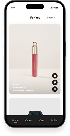
The first experience


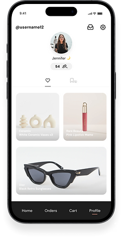
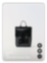
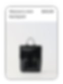
Product discovery and add to wishlist
Filtering options


Product detail page
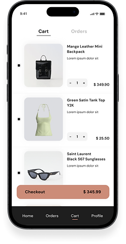
Shopping cart


One-click checkout & order tracking
Making shopping more social


Passwordless sign up
Learnings
During the design process I experienced first hand how understanding the target audience and their specific pain points is fundamental to design with purpose and deliver a tailored shopping experience. I also learnerd how important it is to balance novelty with familiarity, incorporating aspects users like from existing platforms, while innovating to solve frustrations.
Making shopping social and interactive improves the user experience. Overcoming the cognitive overload created by existing platforms is possible through thoughtful personalization. And last but not least, iterative design with user feedback is the best way of refining products and ensuring it suits user needs.
Next Steps
After tackling the core experience, my focus will shift to designing the messaging interface, and the experience for order tracking, where I'm looking to enable users to check the status of each specific product. I'll also develop a desktop version of the app, focusing on interoperability between app and web sessions so users can seamlessly switch between one and the other.